

Getting someone to sign up is only the start. The hard part is helping them reach the first moment when your product feels useful.
That is why activation matters more than a growing signup chart. If new users do not reach a real outcome, more traffic simply gives you a larger group of people who leave.
Senja, a testimonial-collection tool, shared a useful case study of this problem. Its founder said fewer than 15% of signups were reaching activation. After a series of onboarding changes, that figure moved closer to 40%. Those numbers are self-reported, so treat them as a case study rather than a promise. The lessons, however, are practical for almost any small SaaS.
1. Define activation as a real value moment
Do not call a user “activated” just because they created an account. Pick the first action that proves they have started receiving value.
For Senja, that meant creating a form, sharing it, or collecting a testimonial. For your product, it might be importing a file, inviting a teammate, publishing a page, or finishing a first project. The action should be close to the reason someone signed up in the first place.
This definition gives every onboarding decision a test: does this help a new user reach that moment sooner?
2. Find the point where users lose momentum
Low activation is rarely one dramatic failure. More often, people hit a small moment of doubt: a long signup form, a blank dashboard, too many setup choices, or a screen that does not explain what to do next.
Watch a few real signup recordings, read support messages, and walk through the first session as a new customer. Look for the moment where the next action stops being obvious. That is usually a better place to work than a broad redesign.
3. Reduce signup friction before it becomes a product problem
Senja added Google sign-up and simplified its signup flow. It also reduced a multi-page set of questions to one page. The point was not to remove every question. It was to remove effort that did not help the user get value.
Audit each field and each screen. Ask: do we need this before the first win, or can we collect it later? A shorter path will not fix a confusing product, but it gives more qualified people a chance to see the product at all.
4. Give users one clear first action
A new user should not need to decide between five equally important things. Senja made its central action obvious: create a form. The rest of the experience supported that move.
Choose one action that leads most directly to value. Put it in the first screen, write it in plain language, and remove competing calls to action. A clear start is often more useful than a clever tour.
5. Never make the first screen feel empty
Blank states ask users to imagine what success will look like. That is a lot of work when they have only just arrived.
Senja used sample content, including a dummy testimonial, so people could immediately see the type of result they were building. Templates, example projects, sample reports, and pre-filled demo data can all do the same job. The example should make the outcome clearer, not turn the product into a fake demo.

6. Create a small win before asking for a big commitment
People continue when they can see progress. Senja celebrated the first form a user created, turning a small setup action into a visible milestone.
Find a win that can happen in minutes, not days. It could be a completed setup step, the first imported record, a finished draft, or a useful recommendation. Then make it feel real: show progress, explain what changed, and point to the most natural next step.
7. Remove dead ends from the journey
Every completed step should answer one question: what should I do now? A thank-you screen with no direction is a dead end. So is a dashboard full of features with no clear priority.
Senja’s team treated this as a design rule: one thing at a time, with no dead ends. You can apply it with simple handoffs. After an import, suggest the first filter. After a form is created, suggest sharing it. After a teammate is invited, suggest the first shared task.
8. Let the product teach the user in context
Long onboarding tours are easy to skip because they explain features before those features matter. Use short, timely guidance instead. Explain a choice when a user has reached that choice.
Senja added form customization within onboarding, so users could make the result feel like their own while they were still moving toward activation. Context matters: teach the smallest useful thing at the moment it becomes useful.
9. Use email to continue, not replace, the product experience
Not everyone finishes in one visit. Senja used information from signup to personalize follow-up emails. That works because a good onboarding email reconnects a user to the exact unfinished job, rather than sending a generic “we miss you” message.
Keep the sequence short. Remind them of the value they wanted, link directly to the next unfinished step, and offer help only where the product cannot make the answer obvious.
10. Add personality after the fundamentals work
Senja also used playful details, including a smiling dog and a small surprise after a period of inactivity. These moments can make a product feel warmer. They are not the reason activation improved.
First remove friction, clarify the first action, show an example, and create a quick win. Then add personality to make the experience memorable. Charm is a multiplier, not a substitute for a clear path.
A first-hour activation audit
Use this checklist with your own product. It focuses on the first session, when the gap between interest and action is at its widest.
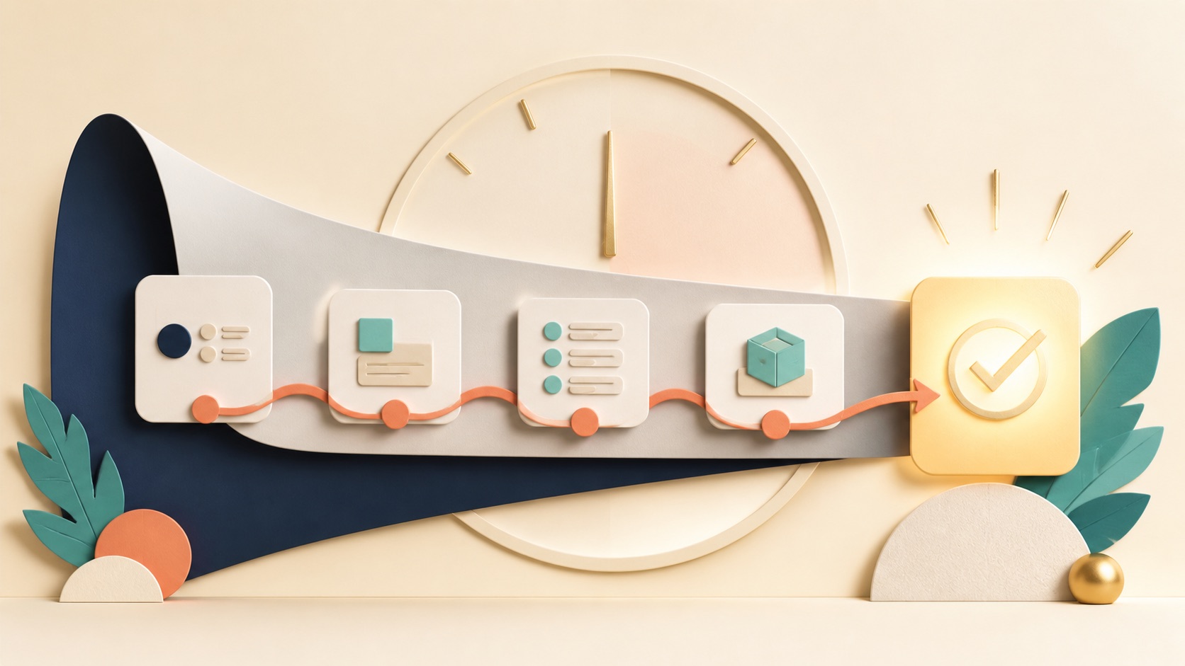
| Moment | Question to ask | A useful fix |
|---|---|---|
| Signup | What can we remove or postpone? | Keep only fields that help the first outcome. |
| First screen | Can a new user name the next action in five seconds? | Use one clear action and reduce competing choices. |
| Empty state | Do users see what success looks like? | Add a useful example, template, or sample data. |
| First action | Does the user get a visible win quickly? | Celebrate progress and lead into the next step. |
| Exit and return | If they leave, do they know exactly where to resume? | Send one focused follow-up linked to the unfinished job. |
Start with the smallest high-impact change
You do not need a full onboarding rebuild. Pick the one point where most users stop, make the next step clearer, and measure whether more people reach your activation event. Then repeat.
Senja’s case is a reminder that activation is not one feature. It is a chain of small decisions that helps a new user move from “I signed up” to “this is useful.”
Where the case comes from
This article is based on Senja founder Oliver Meakings’ account of the team’s onboarding changes and results. Read the original case study: How Senja doubled SaaS activation.


Comments are closed for this article.